| | Forum Disigns |  |
|
|
|
| Author | Message |
|---|
Noobface
Extreme Forummer

Posts : 471
 |  Subject: Re: Forum Disigns Sun Apr 17, 2011 12:22 am Subject: Re: Forum Disigns Sun Apr 17, 2011 12:22 am | |
| We are all well aware for you have said that 200 (probably a close exaggeration) times. | |
|
 | |
2D4
Critique Extraordinaire

Posts : 3451
| | Subject: Re: Forum Disigns Sun Apr 17, 2011 12:48 am | |
|  I made it a littlebit darker.This would be it. | |
|
| | |
Noobface
Extreme Forummer
Posts : 471
| | Subject: Re: Forum Disigns Sun Apr 17, 2011 12:49 am | |
| I love it. Make the things smaller though; it is too big. | |
|
| | |
TheHat
H€®Ø

Posts : 919
| | Subject: Re: Forum Disigns Sun Apr 17, 2011 12:50 am | |
| im... so sorry about this.
PAGAENT OF THE SLUNKS. | |
|
| | |
2D4
Critique Extraordinaire
Posts : 3451
| | Subject: Re: Forum Disigns Sun Apr 17, 2011 1:22 am | |
| - 2D4 wrote:
I made it a littlebit darker.This would be it. Yea, the pattern should be smaller, I blew the thing up.So this, or even darker still | |
|
| | |
Noobface
Extreme Forummer
Posts : 471
| | Subject: Re: Forum Disigns Sun Apr 17, 2011 1:25 am | |
| Those are nice colors, but it doesn't match the RR style when you blow it up. P.S. I want this, still:  | |
|
| | |
2D4
Critique Extraordinaire
Posts : 3451
| | Subject: Re: Forum Disigns Sun Apr 17, 2011 2:55 am | |
| I allready said: blow it down, it's not suposed to blown up ( sigh . . ) I think your grey is too dark and I miss a visible pattern.I also miss the greygreenish blue that the game background has, I think that is especially sweet.At the same time I wouldn't mind if we took one that is much darker as mine still.As long as it's still that color only my personal taste. I made two shades that I think may work.Good luck  or even  I know it doesnt have the pattern.These samples are just for the shade. The pattern should still be added
Last edited by 2D4 on Sun Apr 17, 2011 2:57 am; edited 1 time in total | |
|
| | |
Noobface
Extreme Forummer
Posts : 471
| | Subject: Re: Forum Disigns Sun Apr 17, 2011 2:57 am | |
| Oh, I meant that, if you blow the one you posted down, it still doesn't match RR. | |
|
| | |
2D4
Critique Extraordinaire
Posts : 3451
| | Subject: Re: Forum Disigns Fri Apr 29, 2011 2:20 am | |
| I want to express my satisfaction with the changes in the forum. It looks and feels fine, I am very content Ps
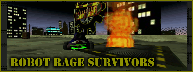
If anyone has a better picture for the forum mainpage (we currently have a one-eyed robot which is fine) feel free to post them
here.Who knows what will come off it  | |
|
| | |
Carl
RR Pro

Posts : 374
| | Subject: Re: Forum Disigns Fri Apr 29, 2011 2:56 am | |
| ^ I think the picture of the arena looks good. I couldn't imagine RRS without it.  | |
|
| | |
2D4
Critique Extraordinaire
Posts : 3451
| | Subject: Re: Forum Disigns Fri Apr 29, 2011 3:24 am | |
| Actually I agree on that. Same here, it should also have the RR sign on it | |
|
| | |
Noobface
Extreme Forummer
Posts : 471
| | Subject: Re: Forum Disigns Sat Apr 30, 2011 5:56 pm | |
| ....it has the RR sign on it in the background -- the one in the arena. Also, I don't know if anyone got this, but I have gotten this:  | |
|
| | |
Carl
RR Pro
Posts : 374
| | Subject: Re: Forum Disigns Sun May 01, 2011 5:16 am | |
| That was mine  Besides, the seamless background is better as it can tile across the whole page. | |
|
| | |
2D4
Critique Extraordinaire
Posts : 3451
| | Subject: Re: Forum Disigns Thu Dec 08, 2011 3:35 am | |
| I know this remark is obsolete .. but everytime I enter this forum I just can't help but think how FFing sweet it looks ! | |
|
| | |
digit
Add mint

Posts : 2594
| | Subject: Re: Forum Disigns Thu Dec 08, 2011 10:22 pm | |
| | |
|
| | |
2D4
Critique Extraordinaire
Posts : 3451
| | Subject: Re: Forum Disigns Fri May 04, 2012 10:43 pm | |
| Whats happenin .. forum is now black and yellow ? Did wiz khalifa buy it or somethin ? | |
|
| | |
2D4
Critique Extraordinaire
Posts : 3451
| | Subject: Re: Forum Disigns Thu Jun 21, 2012 11:04 pm | |
| Hey East, could you do me a favor and change the brown red reminiscent color of the spoiler to something else, like black, grey or anything that would fit the forum ? It would also be nice if the spoiler can be shorter in cases where the content inside is also short, that would look so much better.
I guess these preview and send buttons below here should also have this new color. Get back at me if you can | |
|
| | |
digit
Add mint
Posts : 2594
| | Subject: Re: Forum Disigns Fri Jun 22, 2012 2:25 am | |
| I've told him to change them at least twice, seems he can't figure out how to or he never saw the messages i sent him. | |
|
| | |
2D4
Critique Extraordinaire
Posts : 3451
| | Subject: Re: Forum Disigns Fri Jun 22, 2012 2:46 am | |
| Okay hmm. Did you get a reply ? Maybe he should give you the keys to the laboratory, since you are here plenty | |
|
| | |
digit
Add mint
Posts : 2594
| | Subject: Re: Forum Disigns Fri Jun 22, 2012 2:49 am | |
| He didn't reply to me directly... I am also considering asking for "the keys to the laboratory"... | |
|
| | |
2D4
Critique Extraordinaire
Posts : 3451
| | Subject: Re: Forum Disigns Fri Jun 22, 2012 2:50 am | |
| He replied indirectly ? nevermind none of my buisniss, I am glad someone agrees with me on the colors | |
|
| | |
Sponsored content
| | Subject: Re: Forum Disigns | |
| |
|
| | |
| | Forum Disigns | |
|