| | About the RRS Sign/mark |  |
|
+52D4 LYCANTHROP jork digit hitech 9 posters |
|
| Author | Message |
|---|
hitech
RR Beginner

Posts : 194
 |  Subject: Re: About the RRS Sign/mark Tue Jun 22, 2010 9:57 pm Subject: Re: About the RRS Sign/mark Tue Jun 22, 2010 9:57 pm | |
| 2D4's is NOT simple. IGIT, 1st one is too simple and loosk like crap
second one has too many details strangely enough.
and east i might as well use the nazi mark and say it was supposed to be a vortex/black hole -_- its still the same crap.
so no, it doesnt matter east its still shit | |
|
 | |
jork
He Who Wants it Brung

Posts : 2161
| | Subject: Re: About the RRS Sign/mark Tue Jun 22, 2010 10:53 pm | |
| - IN GOD I TRUST wrote:
- it's not simple enough. maybe without the letters
2D4 showed me this mark without the RRS lettering, I suppose he added it just to show it's RRS, the mark doesn't have to contain the lettering. | |
|
| | |
LYCANTHROP
RR Beginner

Posts : 113
| | Subject: Re: About the RRS Sign/mark Wed Jun 23, 2010 7:29 am | |
| - IN GOD I TRUST wrote:
- it's not simple enough. maybe without the letters
those are Doomsdays colors so I cant agree with it! | |
|
| | |
2D4
Critique Extraordinaire

Posts : 3451
| | Subject: Re: About the RRS Sign/mark Wed Jun 23, 2010 9:42 pm | |
| Lol, thanks 4 posting my idea jork.
A few things:
The RRS lettering does NOT belong in the original design, and without it the mark is surprisingly simple to make: try it 4 yourself sometime.The color is optional, if there is any need 4 a definative color we can choose another.
IGIT I think your first one looks like a warning on a washing label in my shirt and the second might do, alltho I would think about labeling yourself as a target haha, good work.
Peace 2 my brothers in arms | |
|
| | |
2D4
Critique Extraordinaire
Posts : 3451
| | Subject: Re: About the RRS Sign/mark Wed Jun 23, 2010 9:46 pm | |
| Ps,
My mark is sort of meant 2 be 3D simplified.So its non-flippable and it it is suposed to have a nucleaR feel 2 it | |
|
| | |
LYCANTHROP
RR Beginner
Posts : 113
| | Subject: Re: About the RRS Sign/mark Thu Jun 24, 2010 10:01 am | |
| hahahahahaDOOMSDAY PWNS ALL CLANS! | |
|
| | |
2D4
Critique Extraordinaire
Posts : 3451
| | Subject: Re: About the RRS Sign/mark Thu Jun 24, 2010 5:42 pm | |
| Doomsday is DOOMED haha  | |
|
| | |
LYCANTHROP
RR Beginner
Posts : 113
| |
| | |
2D4
Critique Extraordinaire
Posts : 3451
| | Subject: Re: About the RRS Sign/mark Thu Jun 24, 2010 6:45 pm | |
| I believe u Lycan I was only kidding .. pleaseeee dont hurt me! | |
|
| | |
2D4
Critique Extraordinaire
Posts : 3451
| | Subject: Re: About the RRS Sign/mark Thu Jun 24, 2010 7:24 pm | |
| Heya
My pc or my clumsyness made it impossible 2 post the images that go along with this message so jork will post them 4 me.
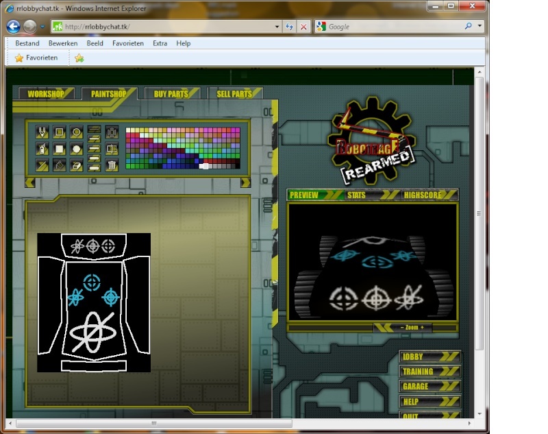
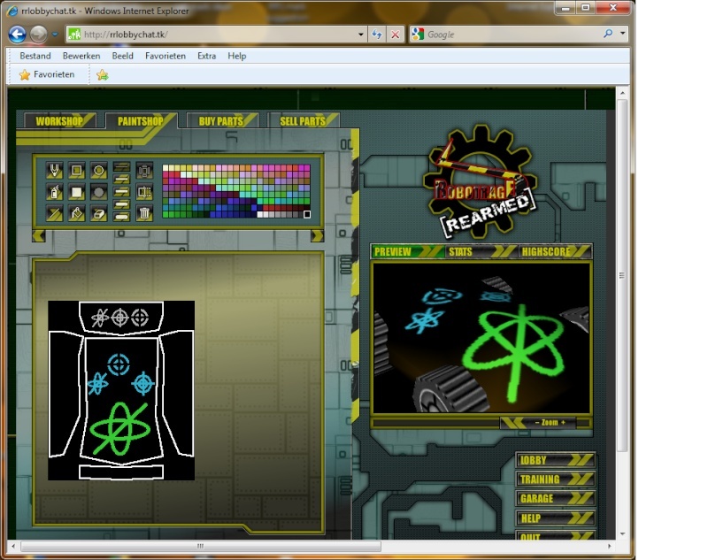
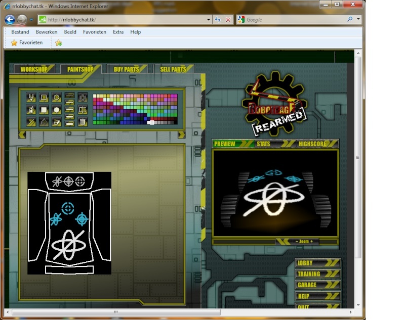
I got another idea based on igit's last mark suggestion, the target sign. I named it M1 , his last sign M2 and my own design M3 for convenience sake.
I think M1 looks kool and I found it was relatively easy 2 make, not as easy as M3 but not much harder.M2 looks okay 2 me but is harder to make then you would think, it's also real hard to get the line running exactly thru the middle wich makes it look off target lol, I havent tried to make M1 in a smaller size, I hope it would still be possible and still look good, I really dont know, M3 has no problems in any size ,color or thickness, it's by far the easiest 2 make but is it also the coolest looking? I personally like it but I also like the way M1 looks,it has a sharp look 2 it.Hope u guys like my work and let me know what u think.
RRS never dies !
2D4 | |
|
| | |
jork
He Who Wants it Brung
Posts : 2161
| | Subject: OMG, I didn't want to cut them out lol Thu Jun 24, 2010 7:44 pm | |
| | |
|
| | |
digit
Add mint

Posts : 2594
| | Subject: Re: About the RRS Sign/mark Thu Jun 24, 2010 8:04 pm | |
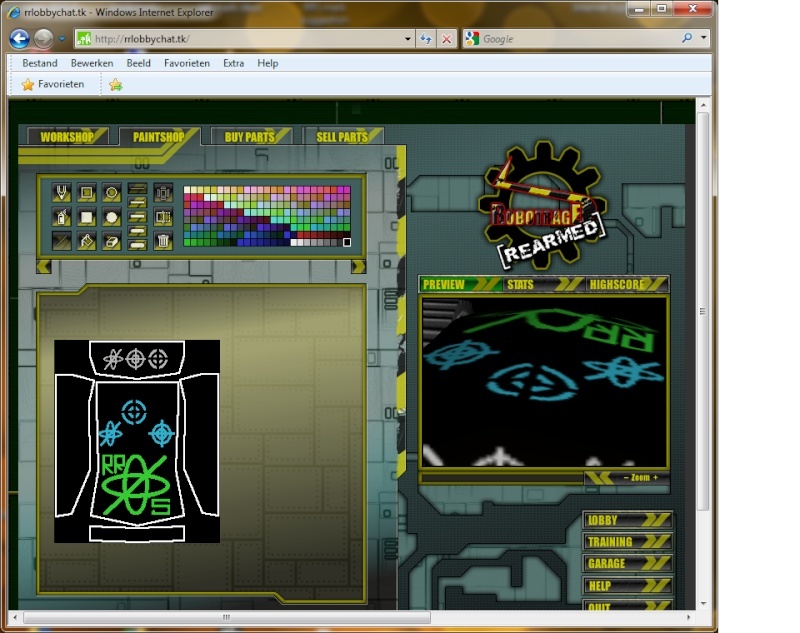
| I like the one on the back. the one to the left (not the one you showed earlier) | |
|
| | |
2D4
Critique Extraordinaire
Posts : 3451
| | Subject: Re: About the RRS Sign/mark Thu Jun 24, 2010 10:20 pm | |
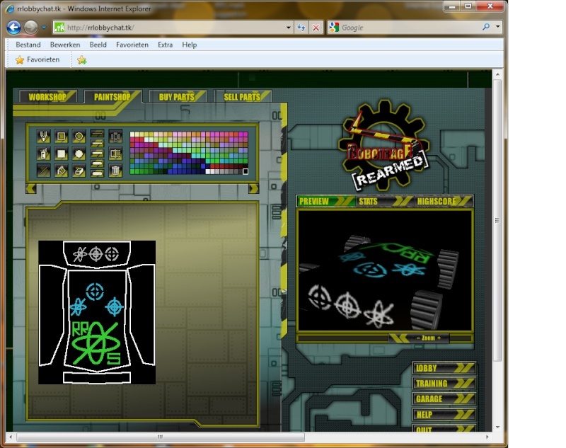
| Jork forgot to post 1 very important picture .. lol Its picture number 0 , it's the one that displays wich sign is M1,M2 and M3.I hope you can still post that pic jork, would be sweet, so we dont have to confuse ourself too hard lol.
So if you look at the back then M1 is the first M2 is the middle and M3 is the sign on the right side; the one I originally made | |
|
| | |
2D4
Critique Extraordinaire
Posts : 3451
| | Subject: Re: About the RRS Sign/mark Thu Jun 24, 2010 10:23 pm | |
| Thanks 4 the help jork,
So do you like that one the best igit? I like it 2 | |
|
| | |
jork
He Who Wants it Brung
Posts : 2161
| | Subject: Re: About the RRS Sign/mark Thu Jun 24, 2010 10:52 pm | |
| - 2D4 wrote:
- Thanks 4 the help jork,
So do you like that one the best igit? I like it 2 Here you go  | |
|
| | |
digit
Add mint
Posts : 2594
| | Subject: Re: About the RRS Sign/mark Thu Jun 24, 2010 11:07 pm | |
| yeah, I was talking about m1 | |
|
| | |
2D4
Critique Extraordinaire
Posts : 3451
| | Subject: Re: About the RRS Sign/mark Fri Jun 25, 2010 2:39 am | |
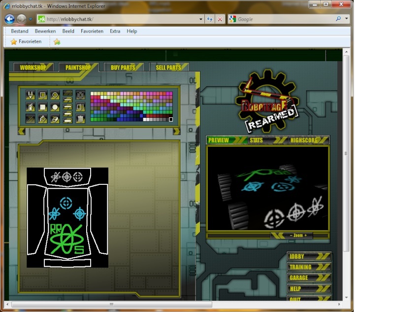
| some random sketches of my logo lol | |
|
| | |
2D4
Critique Extraordinaire
Posts : 3451
| | Subject: Re: About the RRS Sign/mark Fri Jun 25, 2010 2:41 am | |
|  Ok I admit it I was brainwashed by aliens | |
|
| | |
2D4
Critique Extraordinaire
Posts : 3451
| | Subject: Re: About the RRS Sign/mark Fri Jun 25, 2010 2:43 am | |
| | |
|
| | |
Carl
RR Pro

Posts : 374
| | Subject: Re: About the RRS Sign/mark Sat Jun 26, 2010 2:16 am | |
|  I think either of these logos look great (the first one was made by me). However, I believe you guys are seriously over-reacting to the whitepower thing. The cross is a symbol of Christianity, and the fact that it was taken by a group of people to support an entirely misguided concept is not to be taken as our fault. -.- Besides, the Nazi Swastika would be obvious if it was drawn that way on purpose. Even the Swastika was used before the Nazis took it as their symbol in many Indian religions. So criticizing the designer of the original logo, for making it based on the whitepower idea, is a completely unfounded claim. I understand you may have thought it was made that way on purpose, but you should be more reserved considering these ideas. | |
|
| | |
2D4
Critique Extraordinaire
Posts : 3451
| | Subject: Re: About the RRS Sign/mark Sat Jun 26, 2010 2:39 am | |
| Hmmm when I read your story I have to say you make sense and you have a valid point.It's just that the original mark (see the start of this thread) looks so much like the white pride world wide logo, and when you draw it white on black like here, even more so, google it you'll see.
Still you convinced me, we can use this ancient symbol just the same, but I like the one on the right side (M1 in my pics) best anyway.It simply looks good.In your picture: It would be better if the black in the center was less big, the same space as the black lines, in other words just run a line thru it I'd say.
Nice job and ty 4 putting us back 2 earth. | |
|
| | |
2D4
Critique Extraordinaire
Posts : 3451
| | Subject: Re: About the RRS Sign/mark Sun Jun 27, 2010 10:21 pm | |
| Hello
Just asking: is the plus with circle mark the final clan mark for RRS? or maybe we could pass a vote on the different options? Im asking cuz I signed up 4 the clan today and I saw that sign below the form. | |
|
| | |
2D4
Critique Extraordinaire
Posts : 3451
| | Subject: Re: About the RRS Sign/mark Sun Jul 04, 2010 5:10 pm | |
| Im changing my mind, I think the original sign is fine , I ve seen it in old viking mythology to, so its a sign that survives the test of time, very well suited 4 this clan | |
|
| | |
BEASTY
The Creator

Posts : 496
| | Subject: Re: About the RRS Sign/mark Thu Jul 08, 2010 6:49 am | |
| yes i do like the ideas they are good. but the true RRS symbol is good. and its to late to change. | |
|
| | |
2D4
Critique Extraordinaire
Posts : 3451
| | Subject: Re: About the RRS Sign/mark Fri Jul 09, 2010 12:20 am | |
| | |
|
| | |
Sponsored content
| | Subject: Re: About the RRS Sign/mark | |
| |
|
| | |
| | About the RRS Sign/mark | |
|


 [img][/img]
